
Printed indices are hour markers, minute tracks, scales, and text applied to a dial as ink on its surface, rather than as separate pieces fixed to it. The overwhelming majority of watch dials ever made received their markings this way, from inexpensive quartz watches to the Omega Speedmaster. Printing is the standard method of putting information on a dial, and it carries nearly everything a dial has to say: the brand name, the minute track, the subdial scales, the depth rating, and the small text at the bottom of the dial that no other technique could produce at that size.
The dominant production method is pad printing, also called tampography. Around it sit two related techniques covered in this article: decal transfers, used for complex graphics and short runs, and the gilt process used on vintage dials, in which the lettering is not ink at all but the dial blank showing through a coating. Each answers a different production problem.

How it works
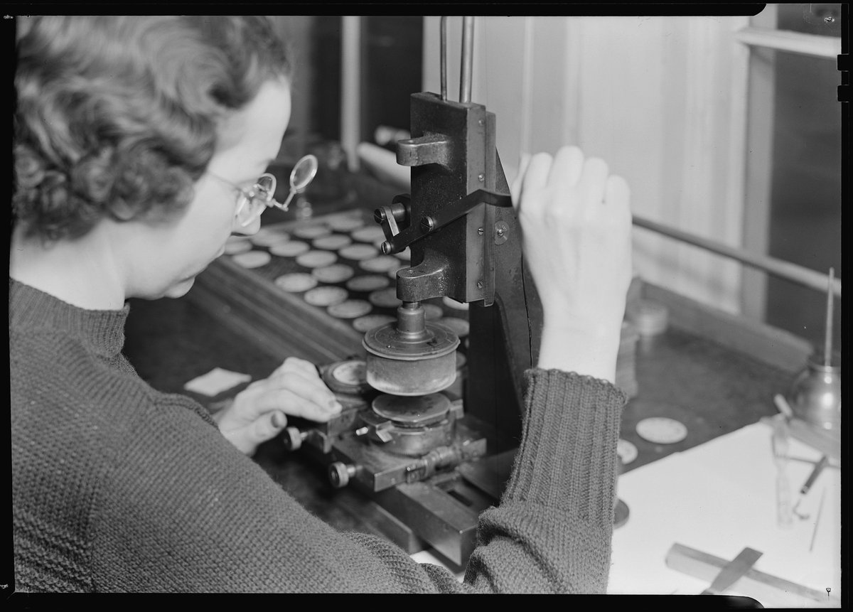
Pad printing begins with the artwork etched into a steel plate called a cliche, so the design exists as tiny recessed grooves in the plate surface. Ink is flooded across the plate, and a blade, or a sealed ink cup, scrapes the surface clean, leaving ink only in the grooves. A soft silicone pad then presses onto the plate, picks up the ink film, and presses it onto the dial. The softness of the pad is the working principle of the whole process: it conforms to curved or textured surfaces that a rigid stamp could not touch, and the transfer itself takes less than a second.
Each color requires its own pass. A dial with white markers, red text, and a blue logo needs three separate cliches, three separate ink mixes, and three separate pad strikes, each registered to the others within a fraction of a millimeter. Registration, landing every pass exactly where it belongs, is where the skill in the process sits. A misregistered dial, with one color offset from the rest, is scrap, and on a production line turning out thousands of dials the adjustment of the machines is continuous work.
Decal transfers take a different route. The artwork is printed onto a special film, the film is floated off its backing in water, slid into position on the dial, and sealed under lacquer. The method handles complex multicolor graphics that would need too many pad passes to be practical. Small independent brands use decals for short runs, and restorers use them to recreate dials that would be uneconomical to print by cliche. A decal sits on top of the dial surface, so it does not integrate with the surface in quite the same way as ink printed directly onto it.
The gilt dial is the special case, and the term is widely misused. Collectors use gilt for the glossy black vintage dials, mostly from Rolex and other makers in the 1950s and 1960s, where the text and markers appear in gold against black. A true gilt dial is not printed with gold ink. The traditional process, as documented by watch restorers, starts with a polished brass dial blank. The text and markers are pad printed onto it with a temporary resist ink. The whole dial then goes into a galvanic bath, which deposits the black coating everywhere except where the resist sits. The resist is washed away, revealing the brass underneath in negative relief. The gold lettering is the dial blank itself, which is why original gilt dials have a depth that gold ink printing does not reproduce.
History
Printing has carried dial text for over a century. The printed Arabic numerals on the enamel dial of a First World War trench watch are an early form of the same arrangement used now: a finished dial surface, with its information applied to that surface in ink. As dial production industrialized, the requirement was for a method that could repeat fine detail identically across thousands of dials, at speed, on whatever surface the dial was made from. Pad printing met that requirement, because the silicone pad adapts to the surface instead of requiring the surface to be flat, and because a single etched cliche holds detail finer than any hand process could repeat.
Each later technique answers a problem pad printing left open. Multicolor graphics with many elements made the one-pass-per-color structure expensive, which is the gap decal transfers fill, particularly for short runs where cutting several cliches cannot be justified. The gilt process answered a different problem, durability and appearance of lettering on a black dial, by making the lettering out of the blank itself rather than a surface ink that could wear. Both techniques remain in use alongside pad printing rather than replacing it, because the problems they solve are still present in dial production.
Where it stands now
Printing dominates dial marking for three reasons: speed, cost, and versatility. A pad printing machine can finish a dial in seconds and repeat the result ten thousand times with minimal variation. It prints on brass, enamel, lacquer, and any other surface that holds ink. Fine text is straightforward for printing and nearly impossible by any other method; small lettering such as a Swiss Made mark at six o’clock or a multi-line depth rating cannot be produced as applied pieces at that scale. Printing also produces effects such as gradient fades and fine miniature scales that no applied marker can reproduce.
Its limitations are physical and permanent. Ink sits on the dial, so a printed marker has no relief and catches no light, and will always look flatter than an applied marker beside it. The ink layer is thin, measured in microns, so it can wear, and some pigments fade with ultraviolet exposure over decades; vintage dials with ghosted, sun-faded text show exactly this failure. Registration errors, though rare on modern lines, cannot be corrected after the pass, where an applied marker can be adjusted before it is fixed. Those trade-offs are accepted because the alternative cannot do the work at all: nearly all of a dial’s typography, and typography is a large part of what a dial looks like, exists because ink can be placed at that scale and at that speed.
Sources
- openPR, What is a pad printing machine: industry trends
- Omega Forums, About the gilt dials
- Patek Philippe Magazine, The Dial Factory (PDF)
Thanks for reading this.